Mapping Public Transit in Cities
Transit Patterns
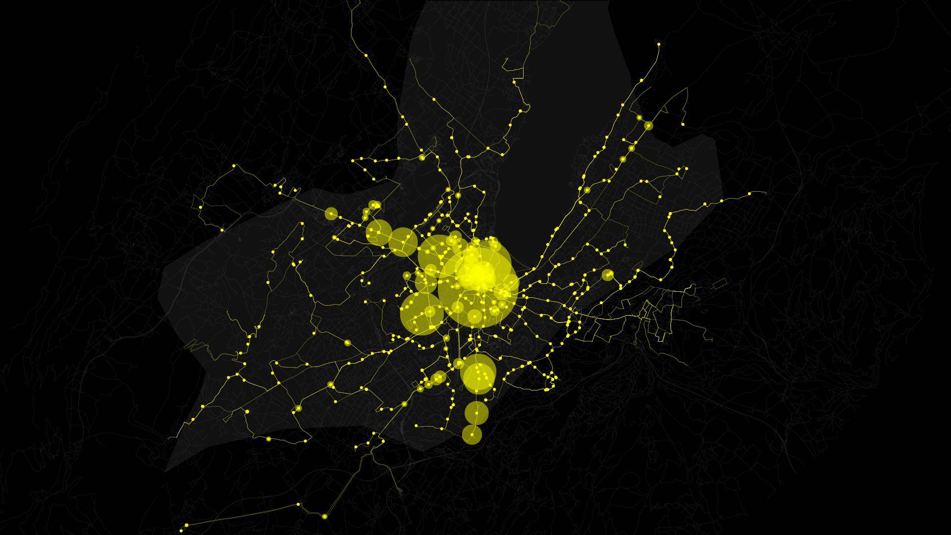
With Transit Patterns, we were interested in using transit data to highlight differences in urban design. A series of three videos visualize public transit ridership data over the course of 24 hours on a single day in 2012, for the cities San Francisco, Zürich, and Geneva. The visualizations show the ebb and flow of ridership as it increases and decreases again throughout the day and how it is facilitated through a city’s infrastructure and urban planning.
San Francisco
Zürich
Geneva
Process
These videos were built using Processing, with data provided by swissnexSF. Our process began by analyzing ridership data by looking for patterns, both temporal and spatial. We gravitated towards a geospatial representation upon noticing the distinct differences in each of the cities and became interested in the sorts of insights one might be able to gain from viewing the data both geographically and over time.

Outcome
In comparing the videos the differences between the three cities are clear. Geneva is centralized while Zürich appears to have multiple centers, and ridership activity is more concentrated during rush hours. Activity in San Francisco is more constant, both spatially and in terms of frequency throughout the day. These kinds of insights would be useful for city planners and transit authorities in analyzing what areas see high and low ridership during particular time intervals and understanding what areas are potentially underserved by public transit and why. The three videos were finalists in the 2013 Urban Data Challenge.


